Accordion
Color
| Class | Property | Color token |
|---|---|---|
.bx--accordion__title | color | $text-01 |
.bx--accordion__content | color | $text-01 |
.bx--accordion__arrow | fill | $icon-01 |
.bx--accordion__item | border-top | $ui-03 |
Typography
All accordion labels are set in sentence case and should not exceed three words. Set body text appropriately based on content.
| Class | Font-size (px/rem) | Font-weight | Type token |
|---|---|---|---|
.bx--accordion__title | 14 / 0.875 | Regular / 400 | $body-long-01 |
.bx--accordion__content | 14 / 0.875 | Regular / 400 | $body-long-01 |
Structure
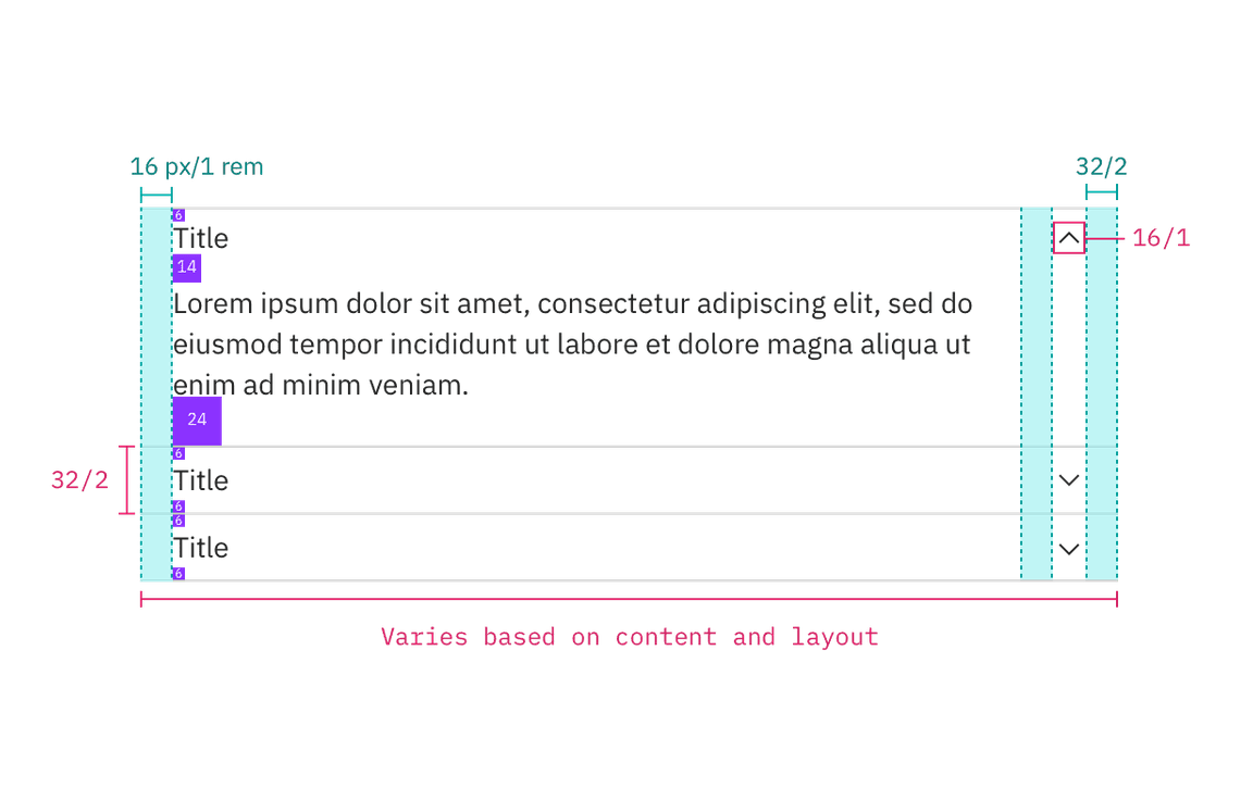
There is no limit to the height of an open row, however, follow the other padding specs below. The width of an accordion varies based on the content, layout, and page design. The chevron icon can be found on the icons library page. Avoid having any text within 16px / 1rem of the accordion’s sides. Additionally, include padding between labels, body copy, and separation lines to provide breathing room between elements.
| Class | Property | px/rem | Spacing token |
|---|---|---|---|
.bx--accordion__heading | height | 32 / 2 | – |
.bx--accordion__item | border-top | 1 | – |
.bx--accordion__arrow | size | 16 / 1 | – |
.bx--accordion__arrow | padding-right | 16 / 1 | $spacing-05 |
.bx--accordion__title | margin-left | 16 / 1 | $spacing-05 |
.bx--accordion__content | padding-right | 25% | – |
.bx--accordion__content | padding-top | 8 / 0.5 | $spacing-03 |
.bx--accordion__content | padding-left | 16 / 1 | $spacing-05 |
.bx--accordion__item--active | padding-bottom | 24 / 1.5 | $spacing-06 |

Structure and spacing measurements for accordion | px / rem